

One way in which colours are categorized is according to the temperatures at which materials emit them, when heated in a vacuum. The phenomenon of warm things emitting light can be observed readily: for instance, when a bar of iron is heated from red, to orange, to yellow, to white. Some of the key colours photographically are those akin to the light of the sun around noon (about 5500° Kelvin) and the light from incandescent bulbs (about 3300° K). Just as with the heated iron bar, the hotter the light source, the ‘cooler’ the temperature appears: ranging from reds and oranges at low temperatures up to greens and blues. This can be a bit confusing, since the colours artists describe as ‘warm’ are actually produced by low temperatures, and vice versa.
Virtually all digital cameras have the ability to adapt to different colour temperatures. This is important because our eyes generally make the correction automatically. Looking at a scene under fluorescent lights, it doesn’t seem as green to us as it really is – and will appear on film or an uncalibrated digital sensor. Exactly how you set the white balance on your camera varies by model and manufacturer, but it is worth checking the manual over.
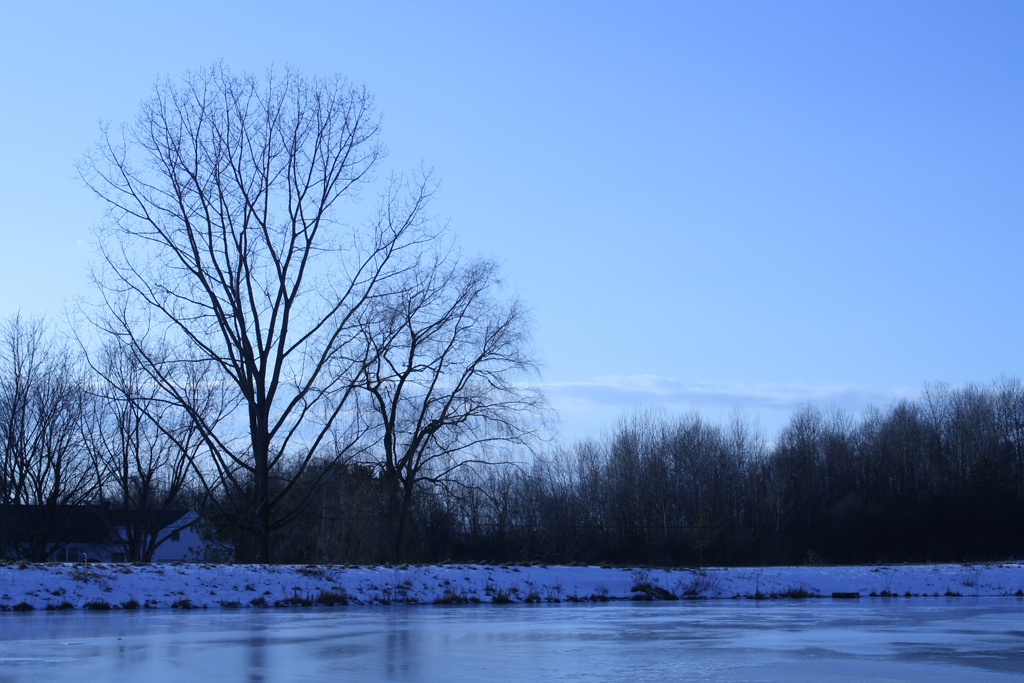
In addition to being used to correct for the dominant type of lighting in a scene, colour balance can be set so as to create a desired look that may not have been present in the original scene. For example, intentionally using the white balance for warm light (low temperature) in a scene with cool light (high temperature) exaggerates the cool light in the scene. As a result, you get a very cool looking photo like this one. By contrast, intentionally using the white balance for cool light (high temperature) in a scene that already has fairly warm light will exaggerate the warm light, as with this photo.
For users of Canon cameras, here is an easy way to try this out:
- First, head out on a cold winter’s day and find a wintery looking scene.
- Then, go into the white balance setting for your camera. If you have a point and shoot camera, this is normally done by setting the control dial on your camera to ‘P,’ then pressing the ‘Func. Set’ button in the middle of the wheel on the back. Scroll down once and you should be in the white balance menu. Press the ‘right’ button until you have ‘Tungsten’ selected.
- If you have a digital SLR, there is usually a dedicated white balance button on the back, labelled ‘WB.’
- Shoot the winter scene with that setting, and you will get a cool blue looking result.
- Secondly, try shooting a warmish scene (such as one taken around sunset outside) with the camera set to ‘Cloudy.’ That will make it look even warmer, which is sometimes attractive.
When you choose a colour balance setting on your digital camera, you are telling it how to process the raw data from the sensor into a JPG image. Since the raw data isn’t normally retained, this is an irreversible choice (though it is possible to approximate a white balance change using software like Photoshop). For cameras capable of recording the data from the sensor as a RAW file, you will be able to select whatever white balance you like after the photo has been taken. Thanks to CHDK, a great many Canon cameras (including inexpensive point and shoot models) can be given this capability.
Incidentally, the matter of what wavelength of light is emitted by objects of different temperatures is a key part of the physics of climate change. One neat thing about science is the way you often run into aspects of one field that are relevant somewhere very different.
Other instructional posts on photography:
Deleting images in iPhoto
The single cheapest way to improve your photography (a mini tripod)
Your rights as a Canadian photographer
Useful A570 IS setting
Studio photography on the (very) cheap
Review: UCO Ultrapod Small Tripod
Your flash can’t light a cathedral
Recommendation for moderately priced digicams (somewhat dated)
Living with low light
On self-representation
My history with light and lenses
Thanks for the reminder. I’ve been meaning to put a spam foiler system in my blog to enable people to comment w/ out an account. I’m getting on it ASAP!
It is tough to find something that catches almost all spam comments, doesn’t catch too many real comments, doesn’t inconvenience users too much, and works with your other software and plugins.
I am using Spam Karma 2 with a special Akismet plugin. Unfortunately, it means I need to do caching using wp-cache rather than WP Super Cache. I don’t really know what the software options are for Drupal.
Colour temperature is a very interesting topic. What’s especially interesting is that we perceive colour temperature somewhat independently of colour. In other words, we see both that something is a colour, and that the light shining on it is making it appear blue or black. This is crucial because it puts a lie to the idea that first we see individual objects and construct a picture out of them – rather we see at the same time the entire field, or gestalt, and judgements we make about it affects how we see individual figures within it.
On the recommendation of photo.net people, I am reading the third edition of Light, Science and Magic.
It’s worth a look. Unlike most books I read, it feels like largely new information that would not have occurred to me for a very long time if I had been thinking about it.
How to Change the White Balance of a JPG
© 2005 KenRockwell.com
In Photoshop on the Mac, just hit Command (the Apple key) B. The hard way is to go to IMAGE > ADJUSTMENTS > COLOR BALANCE.
One reason why portraits often look better in black and white is because it is hard to properly express skin tones using film or digital sensors and artificial lights. Our brains are very sensitive to skin tone, so getting it wrong makes people look bad.
Here is a bit of interesting information on why we might care so much:
“As I have argued in my research, our color vision is a distinctive kind of color vision, one that is specialized for detecting the color changes that happen in skin due to the physiological changes in blood (e.g., oxygenation). Most varieties of color vision – like that in birds, reptiles and bees – do not have this extraordinary capability. Our color vision is for seeing blushes, blanches, red rage, sexual engorgement and the many other skin color changes that occur as one’s emotion, mood, or physiology alters. Color is for seeing embarrassment, fear, anger, sexual excitement, and so on.”
Metamerism (color)
From Wikipedia, the free encyclopedia
In colorimetry, metamerism is the matching of apparent color of objects with different spectral power distributions. Colors that match this way are called metamers.
A spectral power distribution describes the proportion of total light emitted, transmitted, or reflected by a color sample at every visible wavelength; it precisely defines the light from any physical stimulus. However, the human eye contains only three color receptors (cone cells), which means that all colors are reduced to three sensory quantities, called the tristimulus values. Metamerism occurs because each type of cone responds to the cumulative energy from a broad range of wavelengths, so that different combinations of light across all wavelengths can produce an equivalent receptor response and the same tristimulus values or color sensation.