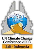
Substantive commentary on the concluded Bali conference can wait a while. Digging through UN pages in search of news, I came upon the terrible official logo:

A blue planet, in front of an ambiguous gray shape, with freakish hands of different hews clasped in front. On top of the sphere, some time of weird, viscous, milky fluid is spreading downwards. Somehow, the logo manages to denigrate both the inspiring unity embodied in photos of the Earth from space and the spirit of cooperation represented by clasped hands. The hands are especially objectionable: drawn with no regard for human anatomy and clearly engaged in arm wrestling rather than a respectful handshake.
Hopefully, the members of the UNFCCC will prove more capable at climatic negotiation over the next few years than they have proved at graphic design, in relation to this conference.

While there are certainly faults with the logo, I think the choice of the grey sillouette of Bali’s Mother Temple of Besakih is appropriate.
My biggest problem (other than the white goo for obvious reasons) is the hit you over the head symbolism of the developed world (white) and developing world (darker) hand image. Pretty lame.
The goo is a real mystery.
We are looking at the world with Bali centred and the south pole at the bottom. Whatever this goo is, it has crossed the equator and is threatening the southern hemisphere.
On the arrangement of the hands:
The most plausible explanation is that they both belong to one person. The white hand is a left hand extended in arm wrestling position. The darker hand is in a really bizarre position: it is a right hand rotated 180˚ from its standard orientation. That would be a really weird way to offer your hand to someone else, but it is relatively easy to do to your own left hand when it is in the position of the white hand in this arrangement.
I presume the Goo represents the melting of the Arctic and the resultant rises in sea level, but I cannot fathom why one would choose such a clumsy representation.
The arm wrestling strikes me as quite amusing, especially given the well-choreographed show-down between the US and India.
I was not previously aware of the Mother Temple of Besakih. It has an extremely brief Wikipedia entry.
Regarding the hands, it is plausible that whoever made the logo used their own hands in this odd position as a model. It really is a lot easier to arrange both of one’s own hands this way than it is to do this with the hands of two people.
It is also notable that the white hand is a rectangle with its long axis parallel to the arm, whereas the rectangle that makes up the bulk of the darker hand is rotated 90˚ to be perpendicular to the arm.
I agree that the goo is probably meant to represent the melting icecap, but that is definitely not a goal artfully accomplished.
COP-13 Ends as COP-OUT
15 Dec 07
BALI, Indonesia – A U.N. climate conference adopted a plan Saturday to negotiate a new global warming pact.European and U.S. envoys dueled into the final hours of the two-week meeting over the European Union’s proposal that the Bali mandate suggest an ambitious goal for cutting industrial nations’ emissions — by 25 to 40 percent below 1990 levels by 2020. That guideline’s specific numbers were eliminated from the text, but an indirect reference was inserted instead.
Aww, look, a black hand shaking a white hand. How adorably post-apartheid 1990s in theme.
On the colour of the hands:
It might be “hit you over the head symbolism” and of a “post-apartheid 1990s” character, but there is really no alternative. If you are going to show two hands shaking in such an image, they cannot both be of the same hue. Neither two white hands nor two hands of any other colour would be acceptable. Cliched or not, they must somehow reflect human diversity.
If you turn the hands to the side slightly, you get a pleading gesture. This might not be altogether inappropriate for the nature of the situation.
A caricature of the arctic melting like a vanilla ice cream scoop is pretty unsettling. But, I am drawn to lick it.
I think I’ll go begging for icecream.