
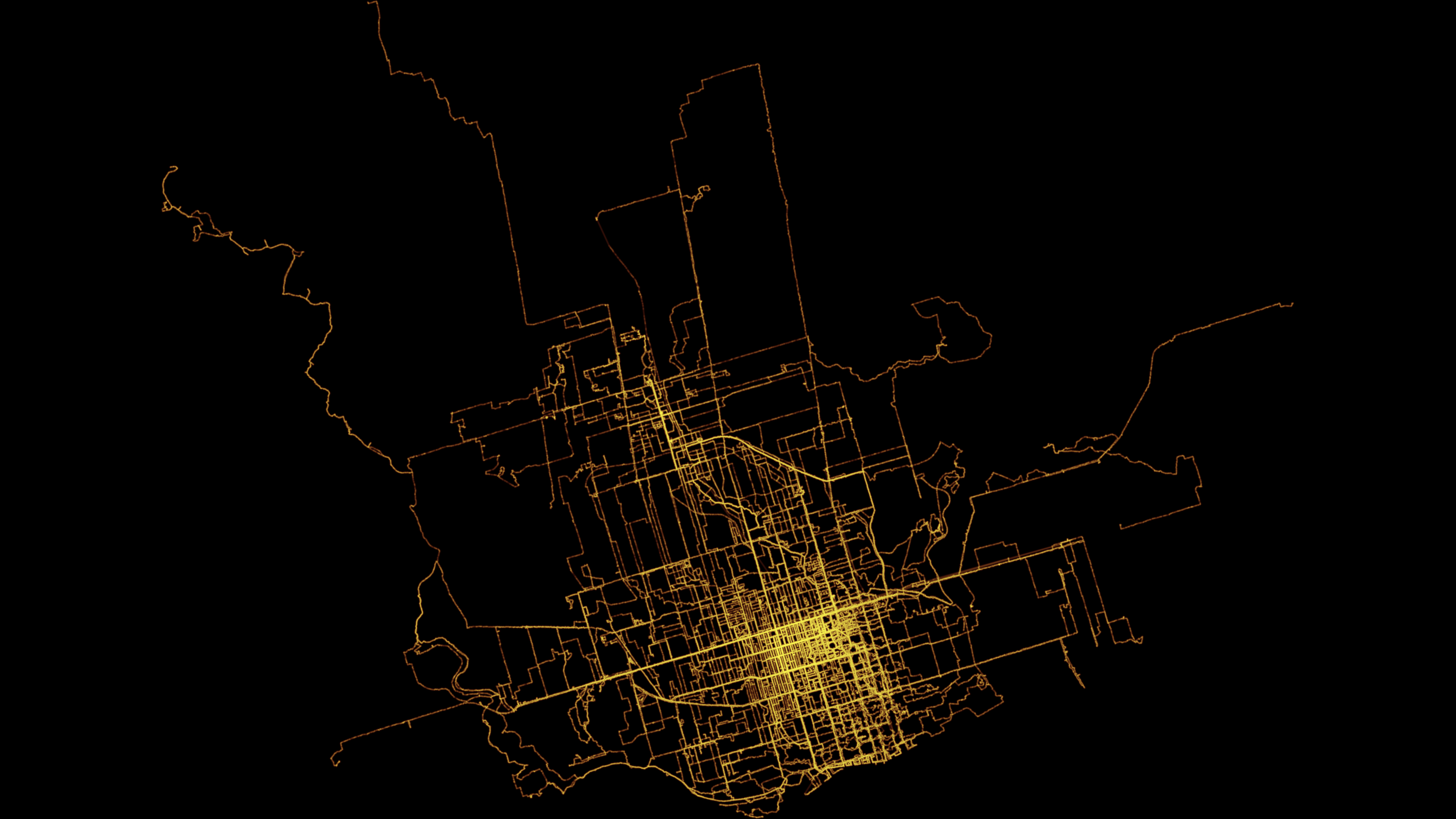
As part of playing around with my GPS data from my exercise walks since I wanted to make a heat map showing the likelihood of being in any particular place.
Here’s one I made using Seth Golub’s heatmap.py Python script (radius 5, decay 0.75):
I also made one in QGIS. First I converted the tracks to a set of points in a CSV file. Then I created a spatial index of the point layer, created a hexagonal grid of polygons of a sensible size, and counted the number of points in each. Then I rendered that as brighter or darker hexagons:
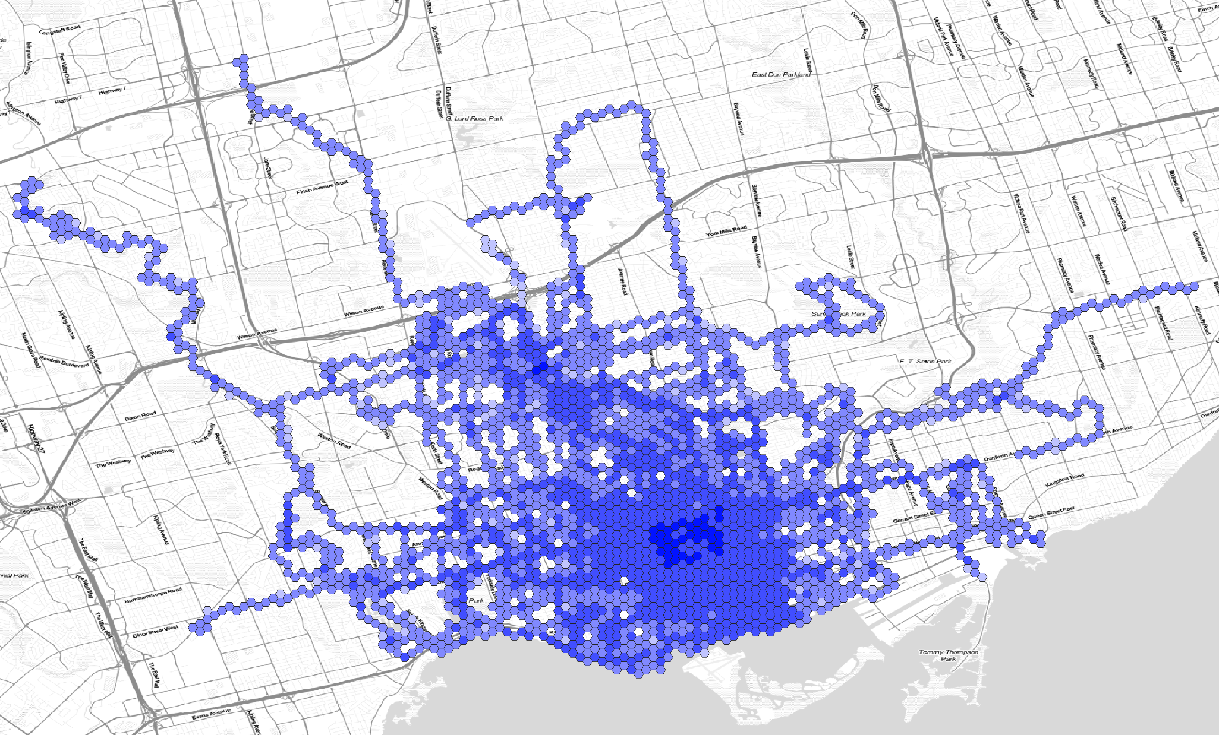
Here are the hexagons semi-transparent and rendered on a faux watercolour of the Toronto area:
![]()
The walks have sometimes been lonely and sometimes been scary, but they have been the main thing getting me out of the house and providing exercise during the pandemic. They do make me feel like I have a broader understanding of the city, though walking through a neighbourhood at night with headphones on only gives you a certain kind of perception.
One down, 39,136 to go: the explorers who walk every street in their city
You don’t really know an urban landscape until you’ve visited all of it on foot – from slums to beauty spots. Just ask the thousands of ‘every-single-streeters’
https://www.theguardian.com/lifeandstyle/2022/may/04/every-single-streeters-explorers-city-street-urban-landscape
A similar idea:
https://twitter.com/KevinOs/status/1482098804841070592
Strava Global Heatmap
Did you do this with Strava?