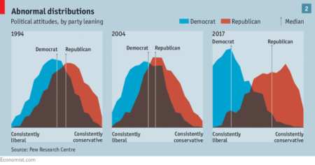
I don’t know the methodology used to create these distributions, but this graphic from a recent Economist article on the political effects of social media shows how Democrats and Republicans have overlapped less and less in the last 25 years:

I would really like to know the method behind creating these shapes. For instance, in both there are “Republicans” who are nearly at the “consistently liberal” outer edge, and “Democrats” nearly on the outer right. My guess is that this is based on party self-identification, but it would be good to know more.
Author: Milan
In the spring of 2005, I graduated from the University of British Columbia with a degree in International Relations and a general focus in the area of environmental politics. In the fall of 2005, I began reading for an M.Phil in IR at Wadham College, Oxford.
Outside school, I am very interested in photography, writing, and the outdoors. I am writing this blog to keep in touch with friends and family around the world, provide a more personal view of graduate student life in Oxford, and pass on some lessons I've learned here.
View all posts by Milan

